
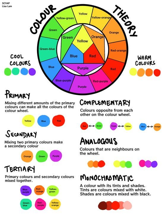
The Components of Color

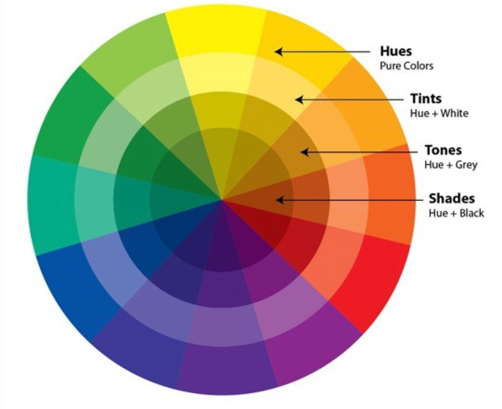
Hue
What is Hue?
Hue is the Color you pick from a wheel.
The specific wavelength range or color family. It's the purest form or the natural pigment of color, such as the primary colors blue, red, and yellow.
The hue is the pure range of colors and their pigment on the Color Wheel
The color wheel consists of primary, secondary, and tertiary colors. This includes:
The three Primary colors: red, green, and blue
The three Secondary colors: orange, green, and purple
The six Tertiary colors: yellow-orange, red-orange, red-violet, blue-violet, blue-green, and yellow-green.
Black, white, and gray aren't considered hues and don't form part of the color wheel. They're defined as Neutral colors. A hue contains no added black, white, or gray.
Examples:
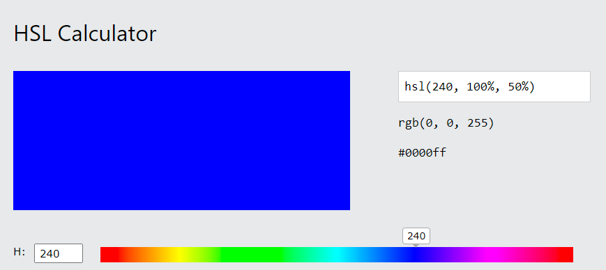
0 or 360 is red.

120 is green

240 is blue


Use it in a sentence: "This winter color scheme uses a purple hue as its base color."
Saturation / Chroma
What is saturation?
Saturation, or chroma, is the purity of a Hue.
It defines the color intensity
Mixing gray (white + black) color to a pure hue decreases the intensity and finally reaches a 0% saturation level
A color can be desaturated by mixing with its Complementary color.
A hue at 0% saturation is a gray color. Saturation defines a range of color intensities from pure color (100%) to gray (0%).
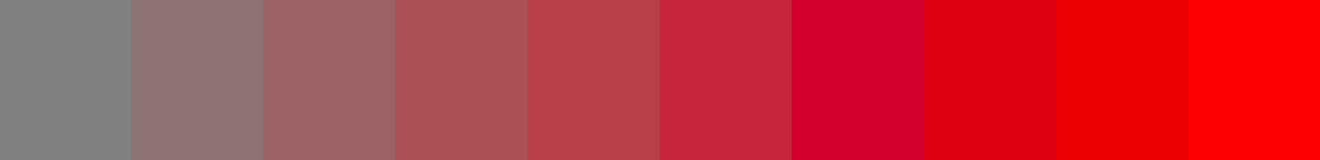

Example
100% means the color is bright and pure.

50% means the color is mixed with gray.

0% means you see only gray, no color.


Use it in a sentence: "Try increasing the color saturation to create a more intense red in your design."
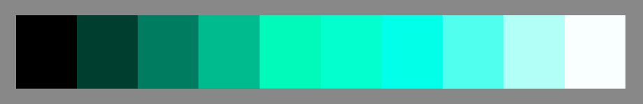
Lightness
What is lightness?
Lightness is how much light a color has.
Lightness defines how light (100%) or dark (0%) a color is
All pure hues have a lightness value of 50%
Lightness is measured relative to the brightness of white color.
In color perception, lightness tells how much light is reflected from a surface.
Value is fundamental in creating depth and perspective within a composition. By skillfully manipulating value, artists and designers can emulate three-dimensionality, form, and light, contributing to the realism and visual appeal of the artwork or design.
Example
0% is very dark.

50% is in the middle, not too dark or light.

100% is very light or bright


