Discover more from Learning with Hanh
Rethinking SaaS Onboarding: From Manuals to Effective Experiences
Move Beyond Manuals to Create a Smarter SaaS Onboarding Experience
When I began working on the onboarding process for a new SaaS product, my client had a clear request: create a help section packed with video tutorials and a comprehensive user manual. It seemed like a logical approach that many products use to educate their users.
But as I started planning, something felt off. I reflected on my own experience as a user—when was the last time I watched a tutorial video or read a manual before diving into a new product? Honestly, I couldn't remember. I usually skip those materials entirely. This made me wonder if there might be a better way to help users understand and see the product's value without relying solely on tutorials or manuals.
Curious to find an alternative, I decided to dive deeper into research to uncover the best approach for onboarding users to a SaaS product. In this article, I’ll walk you through the lessons I’ve learned and how they shaped my thinking on what makes an onboarding experience truly effective.
What is Product Onboarding?
Product onboarding is the process of guiding users to understand and effectively use a product, ensuring they recognize its value and key features.
While onboarding may start with an initial introduction, it’s not a one-time event or a single feature. Instead, it’s a continuous process involving various activities, such as tutorials, videos, setup flows, and product walkthroughs, which gradually help users become proficient.
Common Onboarding Methods
Video tutorials, or User manual
Strength: Provide users with detailed visual and textual guidance. Video tutorials engage visually while user manuals serve as reference material for in-depth understanding.
Weakness: Overwhelm users, especially if the video is long or the manual is dense with information.
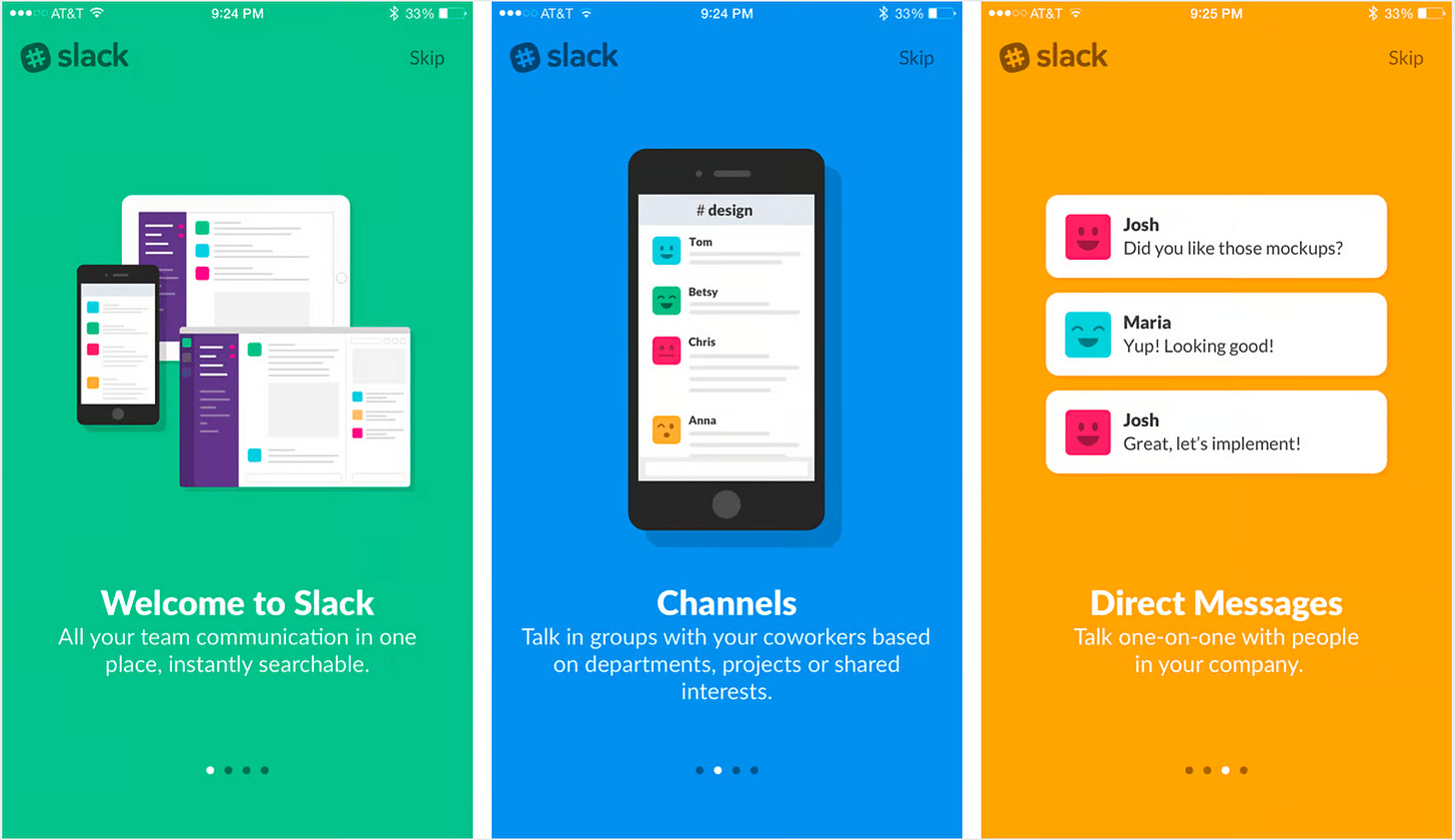
Welcome Screens:
Strength: Provides a quick overview of value and app navigation.
Weakness: Often feels superficial and may not hold users’ attention, especially as they skip through to start using the app.
Product Tours:
Strength: Offers a more detailed walkthrough, usually in a video, documented manual, or slideshow.
Weakness: Many users skip the tour, which means it often doesn't provide lasting value. Users want to dive in and explore themselves.
Progress Bars and Checklists
Strength: Visualize how far a user has come in the onboarding process and how much is left. This taps into the Zeigarnik Effect, a psychological principle where people feel compelled to complete unfinished tasks.
Weakness: Users might focus too much on completing individual tasks, rather than understanding the overall onboarding flow.
Tooltips & Hotspots:
Strength: Introduces key features as users explore, which can help reduce overwhelming first impressions.
Weakness: Still "front-loaded" as it interrupts initial exploration, which can make users feel they need to memorize information upfront.
Issues with These Methods
All these above methods fall into the category of passive instructional techniques, because they just show the information in front of the user, and often fail to onboard newcomers effectively. But why? Enter a concept known as the paradox of the active user, first named by Mary Beth Rosson and John M. Carroll, researchers at IBM in the 1980s. Rosson and Carroll were studying how people acclimated to computer software. They noticed participants in their studies seldom referred to the training guides provided to them and instead dived right into new software to try a few tasks for themselves. They did this even if it meant encountering errors and dead ends.
How come? Because the new users were motivated by the specific goals they wanted to achieve, not by the larger potential of the technology. They were uninterested in taking time up front to learn about all the features they might benefit from in the future when there were actions they could benefit from immediately. As a result, each person’s understanding of what this software was capable of was often limited to the tasks they did first.
Rosson and Carroll called this a paradox because people could get more from software if they spent time learning about it up front. However, we can’t design for this because people don’t behave in such an idealized way. So that These front-loaded methods I listed above are great for delivering an overview or initial instructions, but they shouldn't be the only tools in your onboarding toolkit. For better user engagement and retention, UX designers should combine these methods with more interactive approaches, like guided interaction techniques.
Guided Interaction: A Better Approach
It turns out that classroom educators have explored this problem. Educational researcher Roxana Moreno and educational psychologist Richard Mayer studied how teaching environments could most effectively help students learn new concepts.
They found that students learned better when these environments interactively guided someone throughout their lessons instead of relying on passive information or letting the students engage in pure discovery.
Game developer George Fan cites this kind of balance for teaching people to play video games: ideally, guidance blends seamlessly into standard gameplay so that you might never know you were guided through a tutorial at all. He used this strategy in the game Plants vs. Zombies, where the first level used simple challenges to familiarize players with key components of gameplay before taking on more complex levels.

What is Guided Interaction?
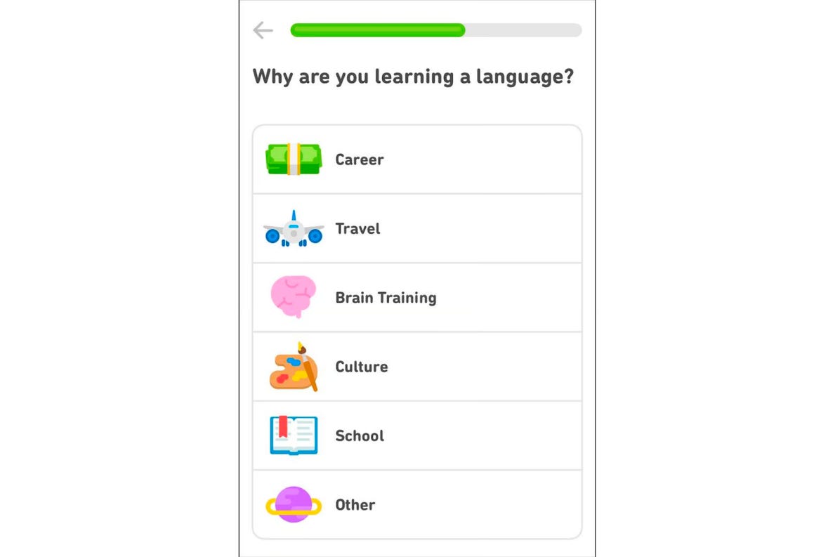
Guided Interaction is an onboarding approach that integrates learning directly into the product experience. Rather than front-loading instructions through videos, manuals, or tours, it allows users to actively engage with the product by performing key tasks and learning as they go.
Instead of relying on passive content, guided interaction provides real-time feedback and breaks down complex actions into manageable steps. This ensures that users aren’t overwhelmed, allowing them to learn progressively and reinforcing their understanding through repetition and immediate application.
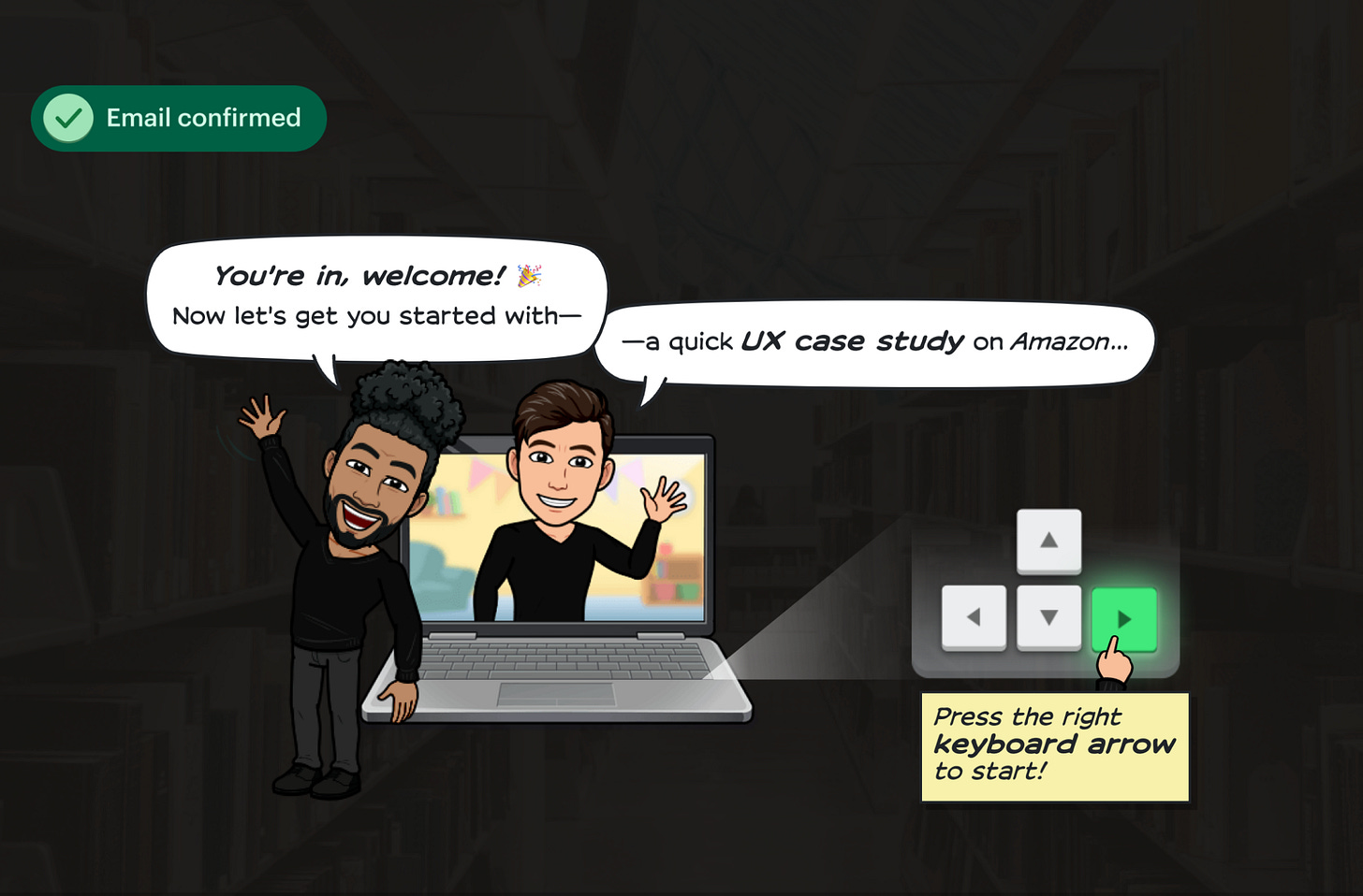
For instance, on growth.design, first-time users are introduced to the website by learning how to read a quick case study. This interactive approach simplifies understanding while guiding the user through their initial experience in a hands-on manner.
Why Guided Interaction is the Best Way to Onboard New Users
This is arguably the best way to onboard new customers for most apps, whether on mobile, desktop, or web. Guided Interactions has accelerated many psychology tips:
Active Learning: Interactive challenges engage users in hands-on learning, reinforcing their understanding of key features by requiring them to apply knowledge, which improves retention.
Cognitive Load: Breaking tasks into smaller, manageable steps during interactive onboarding helps reduce cognitive overload, making it easier for users to absorb essential information without feeling overwhelmed.
Immediate Feedback: Users receive instant feedback during onboarding, reinforcing correct actions and providing a sense of accomplishment, which reduces frustration and improves learning outcomes.
Gamification & Motivation: By incorporating game-like mechanics, such as challenges and rewards, onboarding taps into users’ intrinsic motivation to explore and master the product, enhancing engagement.
Self-Efficacy: Successfully completing tasks during onboarding builds users’ confidence in using the product, making them more likely to continue and reducing drop-off rates.
How to Make a Good Guided Interaction
1. Define the Basic Journey
Identifying the core steps that most users need to follow when interacting with the product ensures that the onboarding experience is aligned with common use cases. These steps will form the basic challenges you guide the user through, helping them develop familiarity with the product through real interaction.
2. Make Guidance Through Each Step
Create Continuity
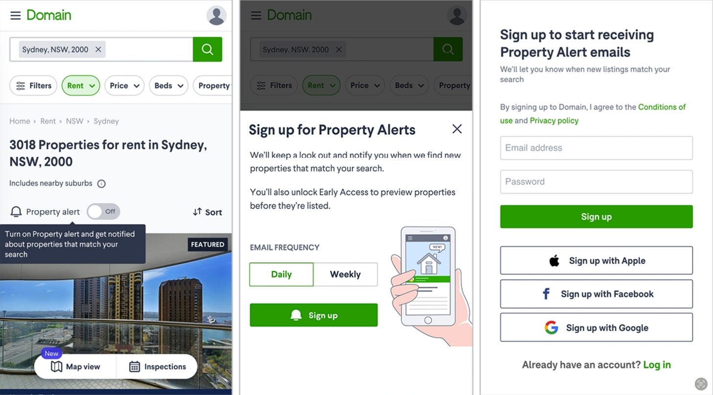
It's crucial to maintain consistent messaging throughout each step of onboarding. By using similar language and imagery, you reinforce the value users are expecting, reducing confusion or misalignment.
For example, Australian real estate company Domain continuously refers to the benefits of property alerts across all screens in this signup flow, expanding on the benefits and details as the user progresses. Meanwhile, if a user came to the signup flow from a prompt to save a property, the messaging in this flow changes to reflect their goal of saving a property. Meanwhile, if a user came to the signup flow from a prompt to save a property, the messaging in this flow changes to reflect their goal of saving a property. This continuity of messaging across the work of the action gives new users confidence that, by the end of the work, the task they initially set out to accomplish will be finished.
Provide Support in Context
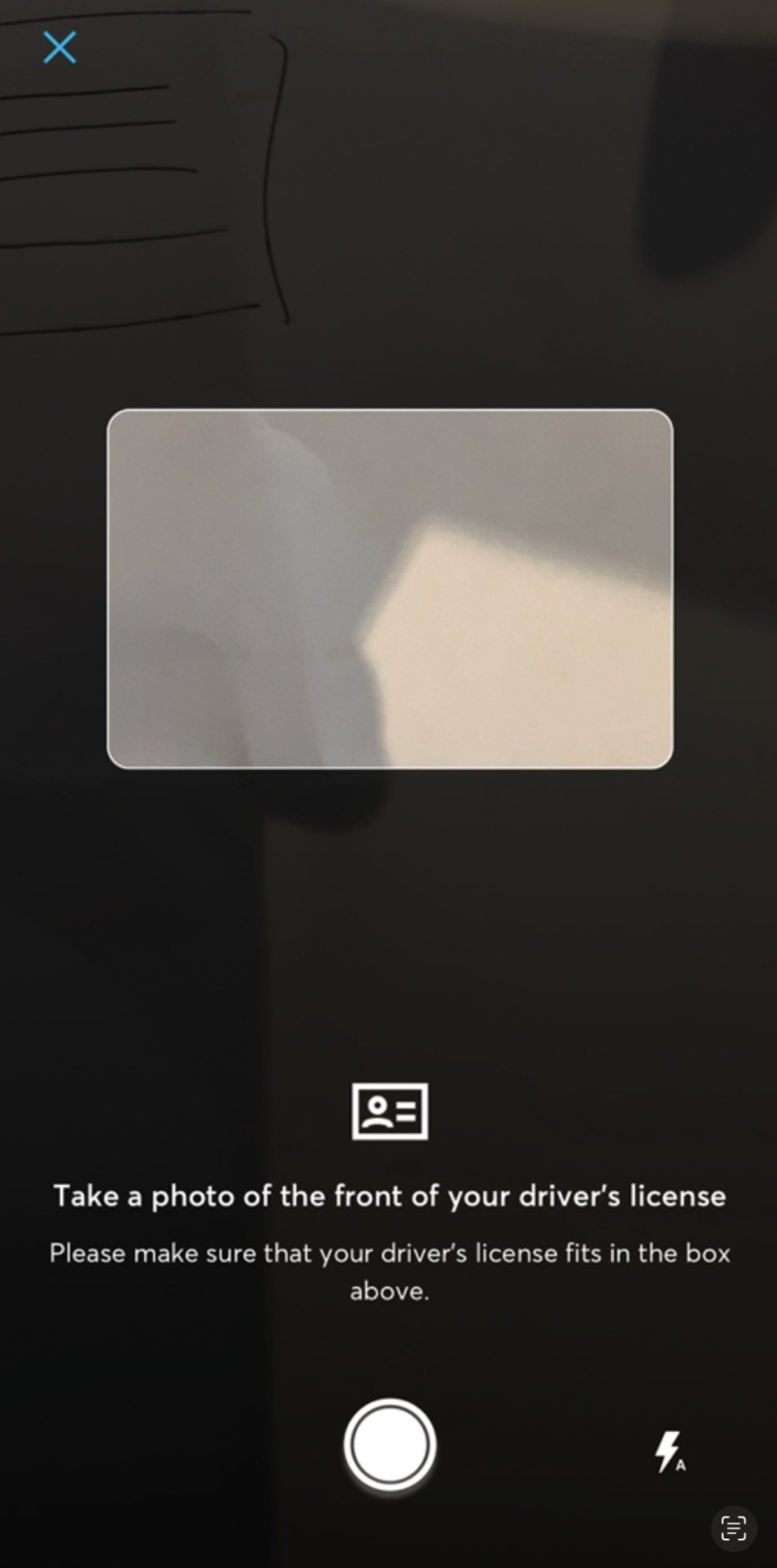
Offering help exactly when and where the user needs it (e.g., on the same screen) avoids disrupting the flow and makes completing actions easier.
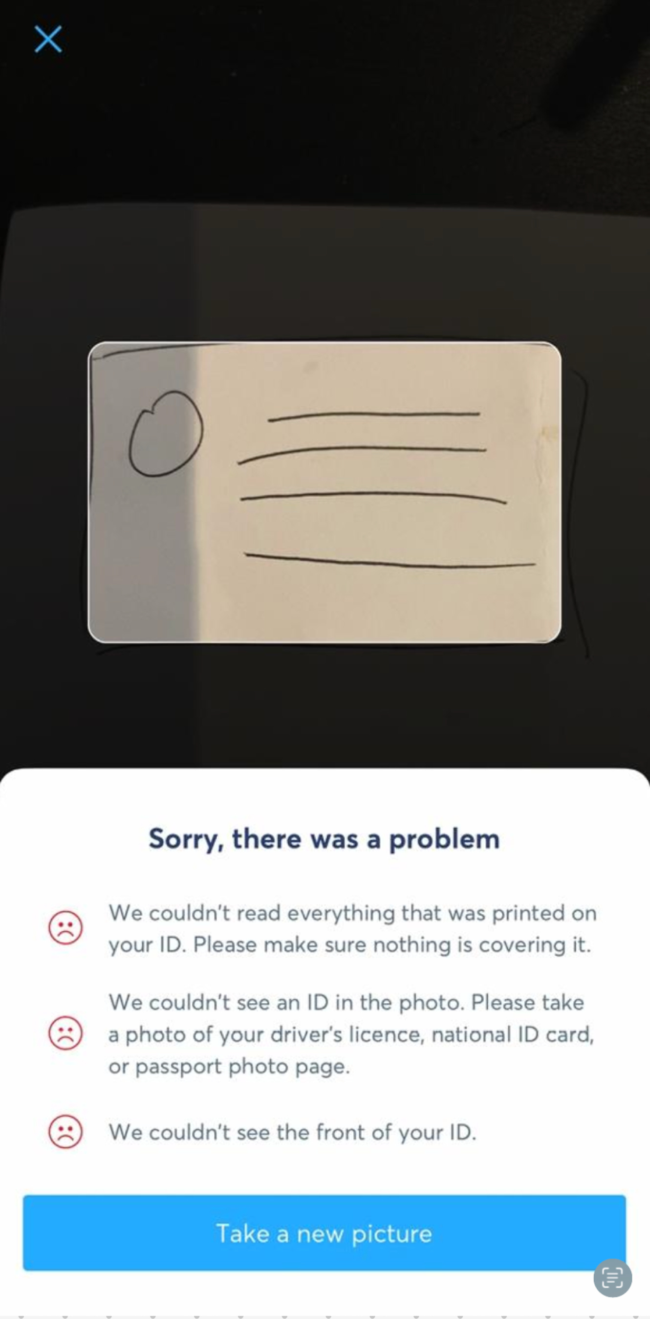
For example, verifying an ID is one of the onboarding actions for new users of the international money transfer app TransferWise. Instructions and a visual guide are presented in the context of the camera screen itself, not separated on a screen that appears beforehand
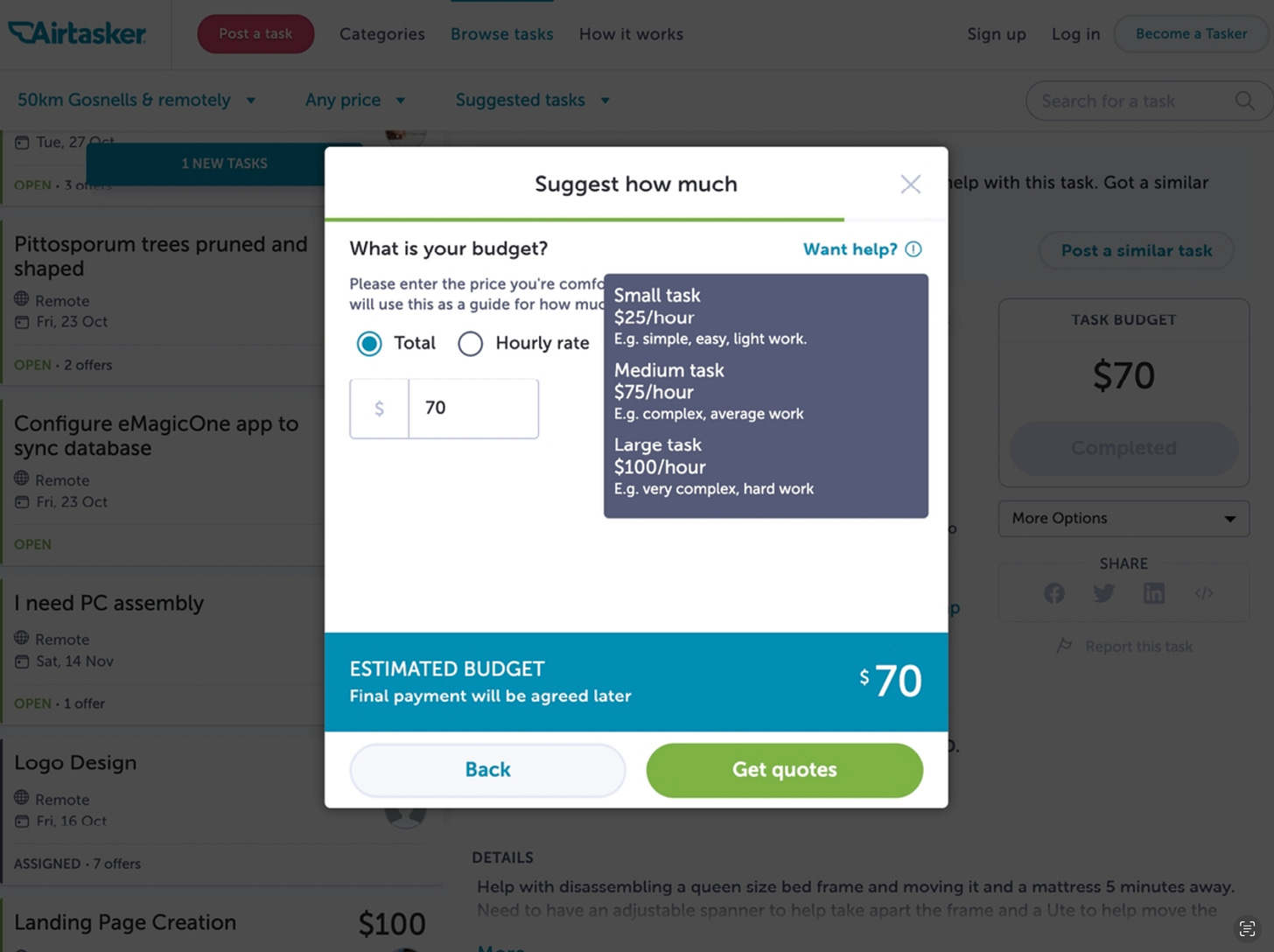
If you need to provide further details that don’t all fit (or would be overwhelming) on a single screen, offer a way for users to see that extra information without leaving their current flow. That’s what freelance job website Airtasker does: it offers a “Want help?” button when someone is pricing a job, which expands a list of suggested price ranges on the current screen.
Offer Alternatives
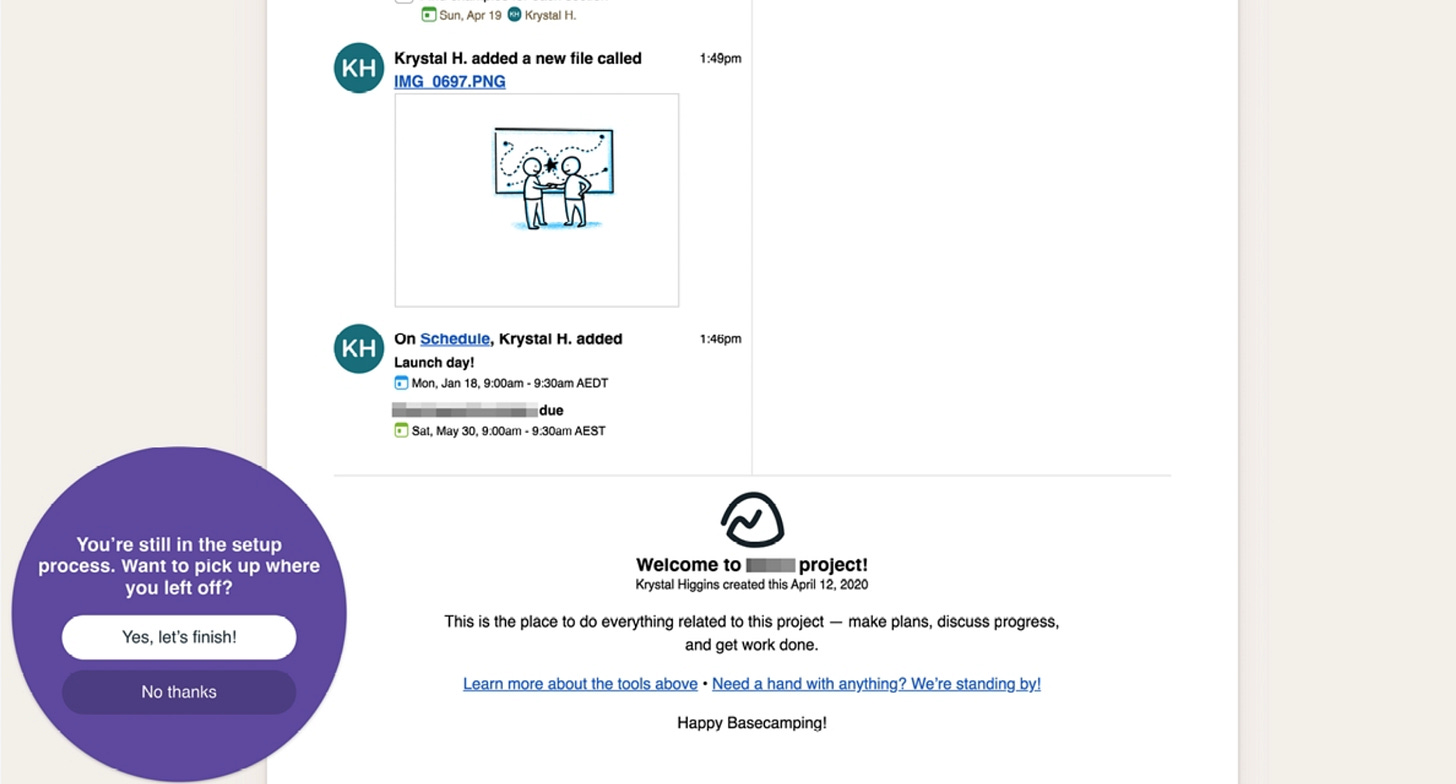
Providing multiple ways to complete tasks and letting users save progress helps accommodate different user preferences and reduces friction.
For example, in Basecamp Personal, a virtual project management tool, users who leave the action of project setup prematurely may jump right back to where they left off. For new users who do not have an account or are otherwise offline, their progress can be saved to local device storage
3. Make Errors Actionable and Informative
Designing errors with clear instructions on why the error happened and how to resolve it ensures that users remain confident and know what action to take next. Offering immediate solutions and connecting them to helpful resources minimizes frustration.
For example, the TransferWise app provides an informative error if the user takes a photo of an unrecognizable ID. The error message provides specific details on why the image didn’t pass the verification requirements, with an action to take another picture. This gives the user tailored information they can use to try for a different result right away, and avoids forcing all users, including those who might never experience an issue, to read a list of all error-preventing instructions upfront.
Example of Guided Interactions
Play-through content
Playthrough content provides an interactive example, built off our product UI, that gives people a boilerplate to work from at their own speed and own pace, without being as directive as a tutorial.
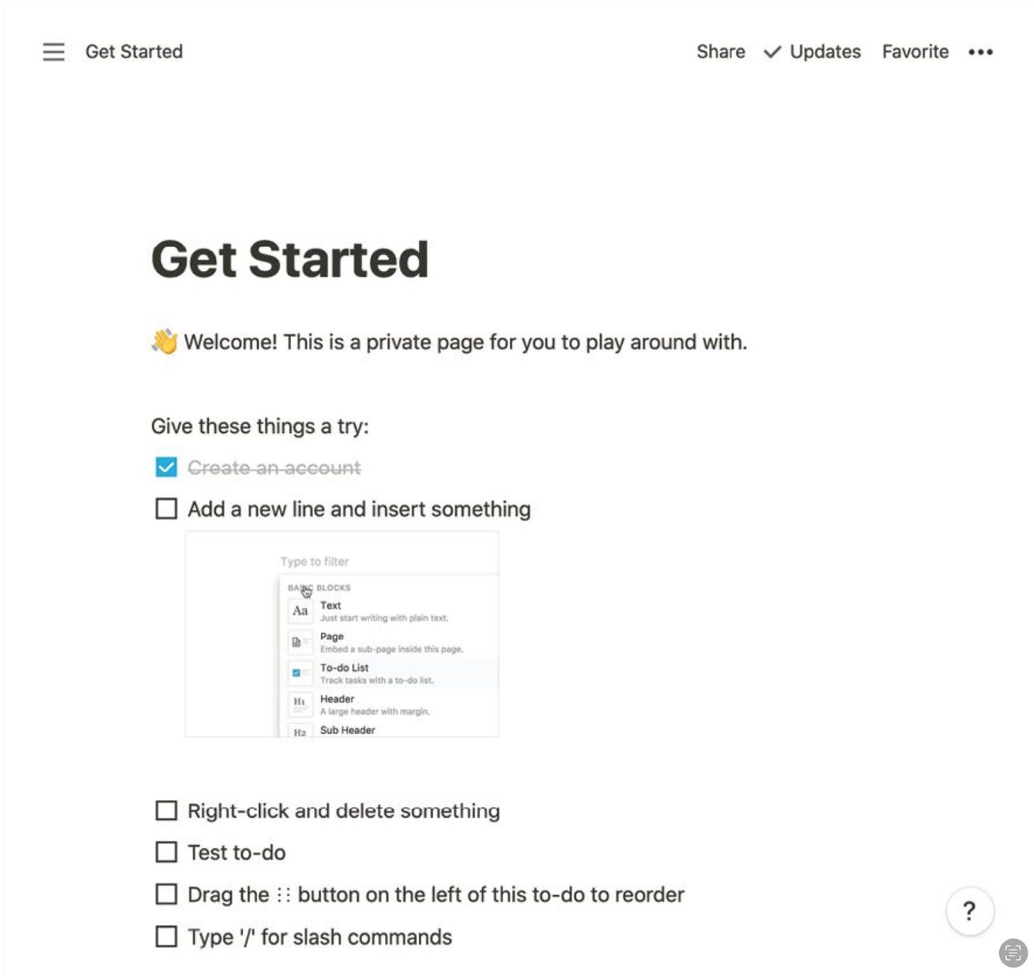
For instance, Notion, a workspace tool, exemplifies this approach through its pre-populated task list in the empty state for new users. Upon landing on a private page, users find a checklist they can customize, change, or follow according to their needs. This transforms the typical “Let’s Get Started” experience into something actionable and directly useful, making onboarding more engaging and effective.
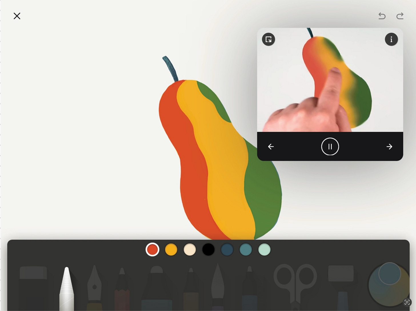
A robust example of playthrough content can be seen in the iPad drawing app Paper by WeTransfer. When new users open the app, they’re introduced to a demo sketchbook, where each page highlights a specific drawing feature. The sketchbook contains editable, pre-made drawings and, in the corner, a non-blocking video that plays to show users how to apply the feature in real-time. This interactive approach helps users manipulate or complete drawings while learning key functionalities. Not only does this make the onboarding experience seamless, but the demo sketchbook can also be revisited anytime for continuous learning.
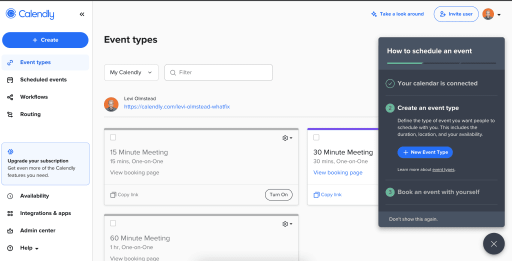
Calendly employs a checklist during its onboarding process to guide new users through the necessary steps for activation. By breaking down what could seem like a complex or overwhelming task into smaller, more digestible actions, the checklist helps simplify the process. The checklist serves as a roadmap, making the product’s value easier to grasp and helping users achieve key milestones progressively, fostering confidence in the early stages of product use.
Presets
Presets are the defaults we apply to settings, and these can make or break a user’s experience since many users will stick with the ones they start with. One analysis of the configuration files of word processor software users found less than 5 percent of users changed their default settings.
If you choose the right presets, you set users up for success. If you choose the wrong ones, or auto-opt users into a setting they aren’t comfortable with, you can create unnecessary work or break their trust. Do your research to know which presets are problematic, which presets set people up for success, and how users can become aware of or change presets.
Not-so empty states
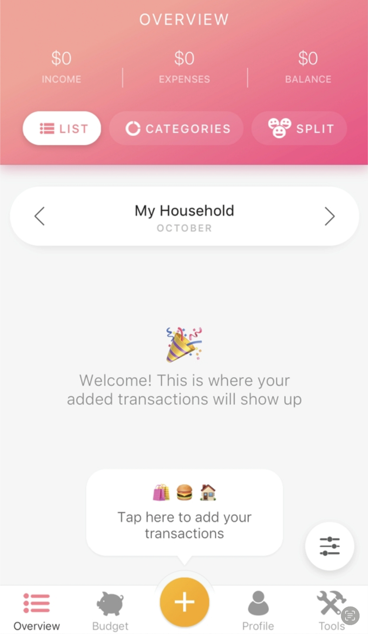
Some new products and features might require the user to create, add, or otherwise populate content, meaning the initial screens a user sees would be empty. Unfortunately, an empty screen doesn’t really help users figure out what they should be doing. These empty states give you a way to provide extra guidance while keeping users in the flow and structure of your core product until the state is populated with content.
A basic version of an empty state is informative and makes obvious any actions the user can take; it doesn’t describe where they should go to complete an action. Buddy Budget, a budgeting tool, uses the empty state of the user’s budget space to visually direct a path to the primary navigation action where they can add their first expense.
Conclusion
Combining traditional onboarding methods with guided interaction can significantly enhance the user experience. By helping users learn progressively, offering immediate feedback, and breaking down complex actions, you create an onboarding journey that feels intuitive and empowering. This approach not only simplifies the learning process but also builds user confidence and long-term engagement.


