This is an article that summarizes my knowledge of UI design. It is intended for learning purposes and will be updated over time. The article reflects my temporary perspective on the research topic, so there will inevitably be some missing arguments. I look forward to receiving your feedback in the comments below the article.
What is a responsive grid?
A grid is an invisible framework that helps organize elements on a web page or app interface
A responsive grid is a flexible layout system used in web design to create websites that adapt seamlessly to different screen sizes.
Why use a responsive grid?
Maintaining Harmony: Grids ensure all your elements, from text to images, align beautifully, fostering a sense of visual balance and professionalism.
Speeding Up Design: No more wrestling with element placement! Grids help you decide where things go quickly and efficiently.
Responsiveness: By using grids, you can create layouts that adapt to different screen sizes (desktop, mobile, tablet) for a seamless user experience.
The anatomy of a responsive grid
A responsive grid consists of four main components: columns, gutters, margins, and breakpoints.

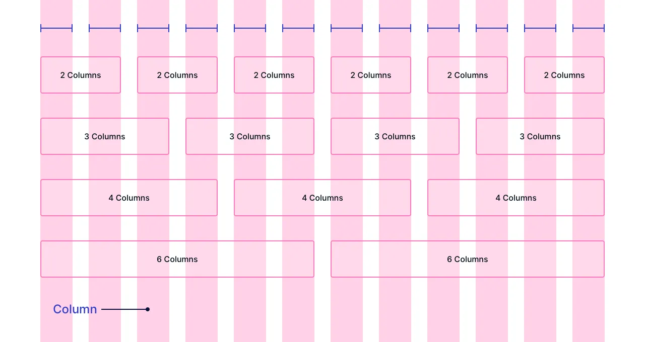
Columns
Columns are invisible vertical sections that structure your content layout.
Collum width definition by:
Percentage (%): columns adjust proportionally to the screen size, offering flexibility.
Fixed Values: columns have a set width (e.g., 72px), offering a more rigid layout.
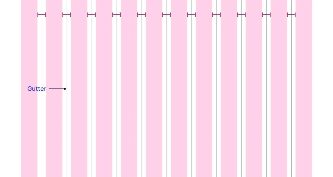
Gutters
Gutters are spaces between columns for improved visual separation and readability.
Gutters width is fixed: Gutter widths are defined using a fixed value (e.g., 16px, 24px) to ensure consistent spacing throughout the layout.
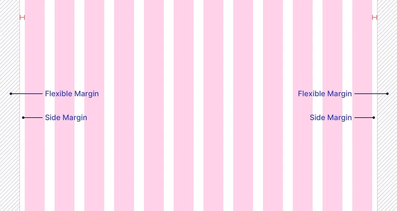
Margins
Margins are breathing room around your content, separating it from the screen's edges.
Types of Margins:
Side Margins: Fixed values define the minimum space on all screen sizes, like a constant buffer zone.
Flexible Margins: Fill the remaining space after defining columns, gutters, and side margins. They adapt to different screen sizes for a balanced and visually appealing layout on any device.
Breakpoints
Breakpoints are specific screen size thresholds, triggering automatic layout adjustments to ensure an optimal experience on any device, whether it's a portrait or landscape smartphone, a tablet, or a large desktop monitor.
How breakpoints work:
Automatic Adjustment: When a breakpoint is reached, your website's layout transforms itself. It might switch from a multi-column layout on a desktop to a single column for easy reading on a mobile phone.
Range-Specific Settings: Each breakpoint range comes with its own set of ideal settings:
Number of Columns: This determines the optimal number of columns in your grid for that screen size, creating a balanced layout.
Margins & Gutters: Spacing values for margins and gutters are also defined at each breakpoint.
Breakpoint system: There isn't a single, universally agreed-upon standard for common device breakpoints. However, some widely used ranges cater to the most common screen sizes encountered on various devices. Here's a breakdown of the Material Design breakpoints:
Extra-small (phone): 0-599px
Small (tablet):
600-904px
905-1239px
Medium (laptop): 1240-1439px
Large (desktop): 1440+
Other common breakpoint sets:
How to design using grids
Design the UI using grids by:
Use Content Containers: Use containers to group UI elements (text, images, buttons, etc.). The containers must be:
Column-Aligned: Ensure containers fit neatly within the defined grid columns.
Full Column Width: Containers should fit exactly within the defined columns, reaching the edges from left to right.
Margin & Gutter Respect: Parent containers must stay entirely within column boundaries. They can never start or end at the edge of the gutters or side margins.

Content in Visible Parent Containers like Cards
Container Types:
Visible: by having a border. Example: cards, banners, etc.

Content in Visible Parent Containers like Cards Invisible: by transparent blocking. Example: text or feature blocks.

Content in Invisible Parent Containers like Feature Blocks


Grid Behavior Across Breakpoints:
There are three main ways grids can behave as screen sizes change:
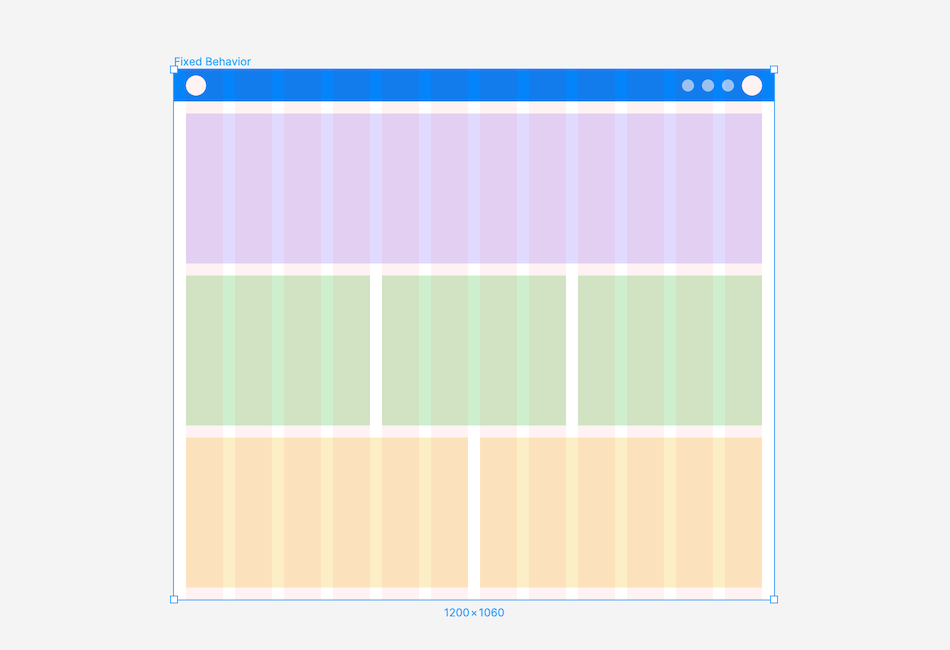
Fixed Grid:
Fixed elements: The width of both the screen and its content containers remain fixed.
Responsive Margins: The flexible margins around the content area will adjust to fill the remaining space as screen sizes change.
This can lead to large empty margins on extra-large screens.

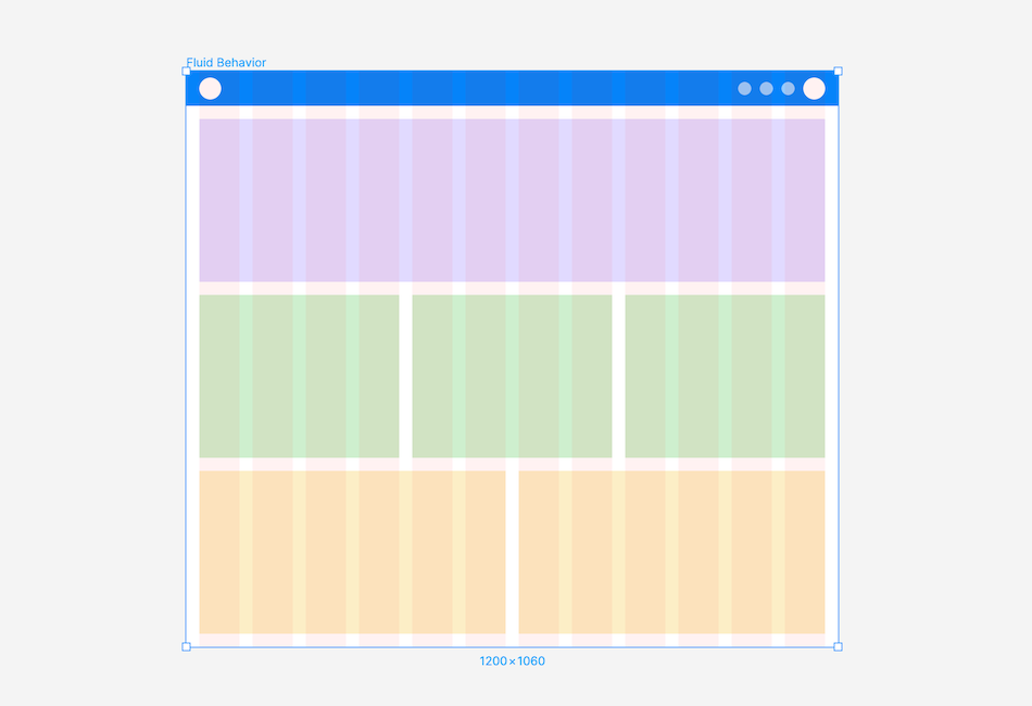
Fluid Grid:
Flexible Columns: Columns and their content automatically adjust their width proportionally to fit the available screen size.
Fixed Gutters & Margins: The gutters and side margins themselves have fixed widths and don't change. There are no flexible margins in this grid behavior
This behavior takes advantage of the available screen space, although components may appear stretched ou

t
Hybrid Grid:
Combined Approach: A hybrid grid combines both fixed-width and fluid-width components for more flexibility.
Example:
Content usually aligns with the grids.
Certain elements, like headers, footers, or full-width images, can extend beyond the grid's defined columns, "bleeding off" the edge-to-edge of the screen.

Hybrid Grid Behavior